[CSS] Layouts: Floats, Flexbox and CSS Grid Fundamentals
The 3 Ways of Building Layouts
What Does “Layout” Mean?
Layout
- Layout is the way text, images and other content is placed and arranged on a webpage.
- Layout gives the page a visual structure, into which we place our content.
- Building a layout: arranging page elements into a visual structure, instead of simply having them placed one after another (normal flow).
Page Layout vs. Component Layout
The 3 Ways of Building Layouts with CSS
- Float Layouts
- The old way of building layouts of all sizes, using the
floatCSS property. - Still used, but getting outdated fast.
- The old way of building layouts of all sizes, using the
- Flexbox
- Modern way of laying out elements in a 1-dimentional row without using floats.
- Perfect for component layouts.
- CSS Grid
- For Laying out element in a fully-fledged 2-dimensional grid.
- Perfect for page layouts and complex components.
Introduction to Flexbox

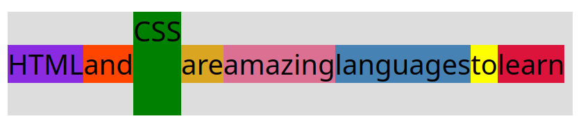
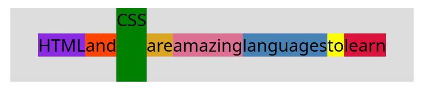
- Horizontally, each of this element takes up exactly the space that is necessary for its text content.
- Vertically, all the flex items are as tall as the tallest element.
-
1
2
3
4
5
6
7
8
9
10
11
12
13
14
15
16
17
18
19
20
21
22
23
24
25
26
27
28
29
30
31
32
33
34
35
36
.el--1 {
  background-color: blueviolet;
}
.el--2 {
  background-color: orangered;
}
.el--3 {
  background-color: green;
  height: 150px;
}
.el--4 {
  background-color: goldenrod;
}
.el--5 {
  background-color: palevioletred;
}
.el--6 {
  background-color: steelblue;
}
.el--7 {
  background-color: yellow;
}
.el--8 {
  background-color: crimson;
}

.container {
  /* STARTER */
  font-family: sans-serif;
  background-color: #ddd;
  font-size: 40px;
  margin: 40px;

  /* FLEXBOX */
  display: flex;
}
Vertical centering
align-items: center;align-items: flex-start;align-items: flex-end;align-items: stretch;-
1
2
3
4
5
6
7
8
9
/* ... */
.container {
  /* STARTER */
  /* ... */

  /* FLEXBOX */
  display: flex;
  align-items: center;
}
Horizontal centering
justify-content: center;justify-content: space-between;-
1
2
3
4
5
6
7
8
9
10
11
12
13
/* ... */
.container {
  /* STARTER */
  font-family: sans-serif;
  background-color: #ddd;
  font-size: 35px;
  margin: 40px;

  /* FLEXBOX */
  display: flex;
  align-items: center;
  justify-content: center;
}
A Flexbox Overview
What is Flexbox?
- Flexbox is a set of related CSS properties for building 1-dimensional layouts.
- The main idea behind flexbox is that empty space inside a container element can be automatically divided by its child elements.
- Flexbox makes it easy to automatically align items to one another inside a parent container, both horizontally and vertically.
- Flexbox solves common problems such as vertical centering and creating equal-height columns.
- Flexbox is perfect for replacing floats, allowing us to write fewer and cleaner HTML and CSS code.
Flexbox Terminology
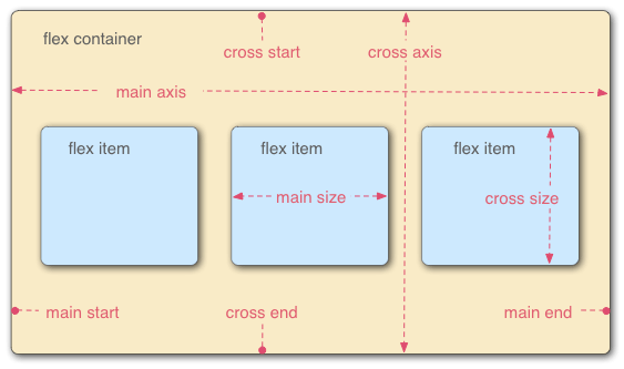
Flex Container
gap- To create space between items, without using margin.
gap: 0 | <length>;
justify-content- To align items along main axis (horizontally, by default).
justify-content: flex-start | flex-end | center | space-between | space-around | space-evenly;
align-items;- To align items along cross axis (vertically, by default).
align-items: stretch | flex-start | flex-end | center | baseline;
flex-direction- To define which is the main axis.
flex-direction: row | row-reverse | column | column-reverse;
flex-wrap- To allow items to wrap into a new line if they are too large.
flex-wrap: nowrap | wrap | wrap-reverse;
align-content- Only applies when there are multiple lines (
flex-wrap: wrap). align-content: stretch | flex-start | flex-end | center | space-between | space-around;
- Only applies when there are multiple lines (
Flex Items
align-self- To overwrite
align-itemsfor individual flex items. align-self: auto | stretch | flex-start | flex-end | center | baseline;
- To overwrite
flex-grow- To allow an element to grow (0 means no, 1+ means yes and ratio).
flex-grow: 0 | <integer>;
flex-shrink- To allow an element to shrink (0 means no, 1+ means yes).
flex-shrink: 1 | <integer>;
flex-basis- To define an item’s width, instead of the width property.
flex-basis: auto | <length>;
flex- Recommended shorthand for
flex-grow,flex-shrink,flex-basis. flex: 0 1 auto | <int> <int> <len>;
- Recommended shorthand for
Spacing and Aligning Flex Items

order- Order of flex items. Every items are of order 0 by default.
order: 0 | <integer>;
gap- Set gaps between flex items.
- Use
gapinstead ofmargin-rightfor each item.
-
1
2
3
4
5
6
7
8
9
10
11
12
13
14
/* ... */
.el--8 {
  background-color: crimson;
  order: -1;
}

.container {
  /* ... */
  /* FLEXBOX */
  display: flex;
  align-items: center;
  justify-content: flex-start;
  gap: 10px;
}
Leave a comment